
By 2025, for every 100 people that live in Guyana 88 will have a mobile subscription, by that same time internet penetration is expected to increase to 45%1. Smartphones will be an important platform for businesses to interact with potential customers. This is why it is essential to take the time to design and develop quality applications for your business.
People make up their minds about a product or service within 90 seconds of interaction. 62 to 90 percent of that assessment is based on colour2. Colour has a huge impact on how we perceive a brand, a website, or an application. A mobile application design companywill understand the importance of colour psychology and choose a palette that aligns with your industry and is conducive to higher conversions.
In this article, we explore the fundamentals of colour theory for mobile app development.
Primary, secondary, and tertiary colours
Colours can be broadly classified into three main categories, primary, secondary and tertiary colours.
- Three primary colours: Red, Yellow and Blue
- Three secondary colours: Orange, Green and Violet
- Six tertiary colours: Yellow-Green, Blue-Green, Blue-Violet, Red-Violet, Red-Orange, Yellow-Orange
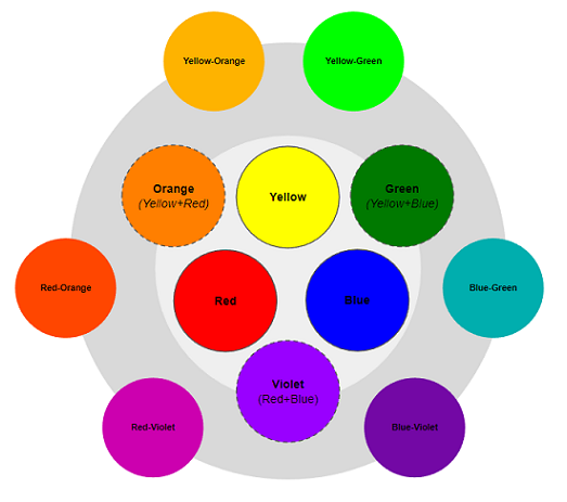
When two primary colours are combined they create a secondary colour. Red and Yellow make Orange, Yellow and Blue make Green, and Red and Blue make Violet. The secondary colours can be combined with the secondary colours to create the six tertiary colours.
Colour temperature: Warm vs Cool
The shades that are a mix of red, orange, and yellow are considered warm colours while the shades that are a mix of blue, green, and violet are considered to be cool colours. Colour temperatures invoke different responses from viewers. Warm colours will make us feel energetic and intense, while cool colours invoke feelings of calm and trust.
This is why you will notice that most retail stores like Amazon and Alibaba will use warm colours like orange and yellow, while health and hospitality websites like Practo or Booking.com will use cool colours like blue.
Contrasting colours for CTAs
A professional mobile app development company in Guyana will be able to logically select the right colour scheme for your business. A good rule of thumb is to select contrasting colours for your CTA buttons. This helps them standout in the application layout. Contrasting colours are usually placed on opposite ends of the colour wheel. So, for example, if the main colour of your layout is blue then a contrasting colour would be yellow-orange.
Tools for colour selection:
- HueSnap: Inspiration can come from a variety of places. If you see a scene while you are out and about and like the colour aesthetics, take a picture. HueSnap can use the image to extract the colours and create a palette for your next project. This can be a great starting point for establishing the colour scheme for your application. Your mobile application design company can then refine the palette to create a more coherent look.
- Adobe Colour: Adobe colour is a free to use tool that has been around for a really long time. You can select a colour you want and play around with the temperature. Then you can add rules like only using ‘monochromatic’ colours or ‘complementary’ colours and the tool will create a palette for you. There is also an explore section where you can see what palettes other users have created and draw inspiration.
- Eggradients: This is a great tool if you are looking for ideas for gradients. Gradients help add depth to a design. They can help elements stand out. If you are looking for ideas on what gradients you can use in your background or just want some inspiration then eggradients is for you.
A skilled mobile app design company will have the knowledge of how to best use these tools to pick the right selection of colour scheme for your business application.

Apart from colour scheme, a good mobile application will have a thoughtful layout, consistent interactions, and a logical architecture. The difference between an average application and a good application comes down to decisions about where you place your buttons, what elements are highlighted, how crowded is the layout, and how easy is it for users to navigate an application.
To ensure you make the right choices, it is recommended that you find a company that provides mobile app development services in Guyana, like WebFX. Contact us to learn more about our services.
Sources:
1. n.d., “Digital Economy – Guyana”, Statista, [available online], available from: https://www.statista.com/outlook/co/digital-economy/guyana [accessed Sep 2022]
2. Jul. 2006, S. Singh, “Impact of color on marketing”, Emerald.com, [available online], available from: https://www.emerald.com/insight/content/doi/10.1108/00251740610673332/full/html [accessed Sep 2022]
Location: Guyana